


Client Vision:
Joe wanted to capture the spirit and energy of club culture’s golden years the feeling of excitement, discovery, and underground connection from the 90s and early 2000s.
They described the brand character “Lola” as hedonistic, bold, playful, and effortlessly cool feminine but with attitude and depth. The logo and visuals should reflect that mix of rebellion, nostalgia, and sophistication.


Design Approach:
Using references from Back2Basics, Hard Times, and The Stone Roses, I built a modular system inspired by club flyers and DIY rave posters.
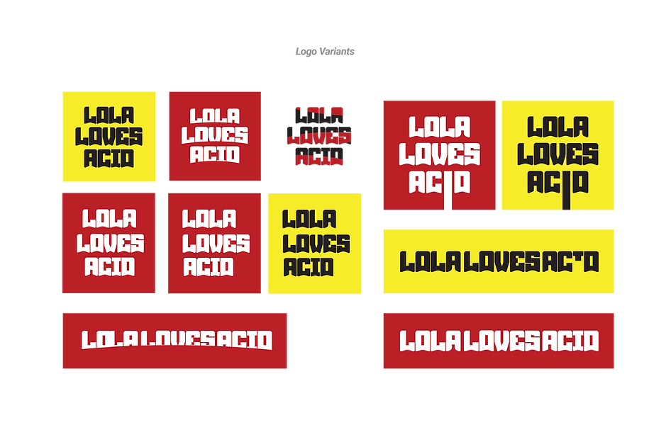
The primary logo uses a stacked wordmark with a bold geometric shape that mirrors vintage club signage.
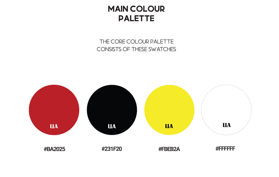
The colour palette: Red (#BA2025), black (#231F20), yellow (#FBEB2A), and white (#FFFFFF) channels classic acid house tones.
Typefaces Momcake and Robus give a playful but structured look, reflecting both grit and glamour.
A series of logo variants were designed for use across digital, print, and merch.
Outcome:
The final identity captures the brand’s hedonistic spirit vibrant, minimal, and instantly recognisable. It provides flexibility for campaigns, events, and collaborations while maintaining a consistent visual energy rooted in club culture.
